

A deep-blue accent wall and creative projections attract passersby as they stop to learn about ships that once sailed on the Potomac River near Alexandria, VA.
What’s the first thing you notice about a work of art, a piece of clothing, a room in a house? Many see color before anything else, and reactions can be visceral! Color can make or break a design. We sat down with Auburn, Cole, and Paloma, three of our expert graphic and experiential designers, to get tips on picking the perfect hue for your new exhibition space. One of the most important tips? Beware of trends. Of-the-moment colors are rarely appropriate unless they relate to your content and your story. More on that to come later in the article . . .
Starting with a “Safe” Palette
When coming up with an initial palette, Paloma says, “I take a lot from what the topic is and then pull from the existing space . . . I start with a theme rather than a color base, so it originates with the content. I also ask what colors a client has gravitated toward in the past. It sounds a bit strange today, but back in school, we learned that a traditional ‘boy color palette’ was always safe—cool colors, blues, grays, greens.”
“I do find myself starting in that area and then thinking, ‘How can we expand this?’ Every room in my house is a different color! I like lots of patterns and colors. . .. Just remember, when you paint something, it’s not permanent.”
Using Content and Context

The sepia-tones in the Reginald F. Lewis Museum’s exhibition about the history of lynching were—in part—inspired by newspapers and archival photos.
While Paloma often builds from a cool palette, Cole has another approach. “For somebody who lives in color, I go with something that’s more instinctual—this or that just feels right. Color for designers is a very personal endeavor,” he explains. “I’ve had a hard time picking colors before I know about the content. I make decisions based on whatever themes are being discussed or a central image, pulling colors from the photos.”
For his recent Quartrefoil work at the Reginald F. Lewis Museum in Baltimore, Cole had a tall order—to create a color palette and designs for an exhibition about the history of lynching in the state of Maryland. It was a project that required sensitivity and a tempered approach that didn’t whitewash the history nor sensationalize it. “I thought of old photos and of fire. These colors spoke of violence to me—charcoal grays, deep reds.”
“Color has a lot of power,” he adds. “There’s a responsibility to treat it the way it’s intended for the audience. Bolder colors often force you to pay more attention, but you don’t want it to overpower the content,” Cole notes. “You don’t want it to compete but to complement, and sometimes, you want the color to disappear.” “Maybe most importantly,” he adds, “You need time to sit with it so you can be certain.” Ask yourself, can you paint the gallery, and let it rest for an ample amount of time? Aside from conservation concerns like the off gassing of paints, you need space to absorb how the color plays in the gallery.
For Auburn, harkening back to the content is critical as are historical references. She says, “I research colors keyed to an era or timeframe . . . but it’s different for a publication than it is for a built environment. The graphics and the environment have to work together.” She often starts with a largely neutral palette, building in one or two accent colors. There are also considerations related to overall proportions, daylight in a gallery, and the reflection that comes from various finishes, especially if you’re working within a space that already has built-in features. It all has to play together. And, there are practical considerations: is this a high-traffic area? How long will the exhibition be up? What is the space actually used for? What’s the vibe?
Accessibility

High contrast colors make content easier to read in this example.
Over the last few years, a much-needed shift toward accessibility has changed the way we approach colors. “It can limit the value range,” Auburn adds. “It’s important to check that your color combinations (used in a gallery or online) are high contrast—that text is readable against the background” and that the use of text over an images is used judiciously. The Smithsonian and AAM have helpful guidelines for design accessibility.
Following Trends
Earlier in the article, we mentioned trendy colors. It seems like dark, earthy tones are everywhere now. (Have you seen charcoal-black color schemes on buildings and houses lately?) Applying trendy colors to a room or personal project is easy enough, but using the same color scheme in a gallery might be ill-advised. “Trends are only appropriate if it relates to the content,” Auburn says. “It has to have some meaning.”
At the Oakland Museum in California, for example, Auburn coupled vibrant terracotta (a Benjamin Moore paint color called Egyptian Clay) with more muted yellows and blues in an exhibition she designed about ceramic artist Edith Heath. The hues were evocative of the Northern California landscape that inspired Heath’s glazes and the mid-century era when she developed her work.
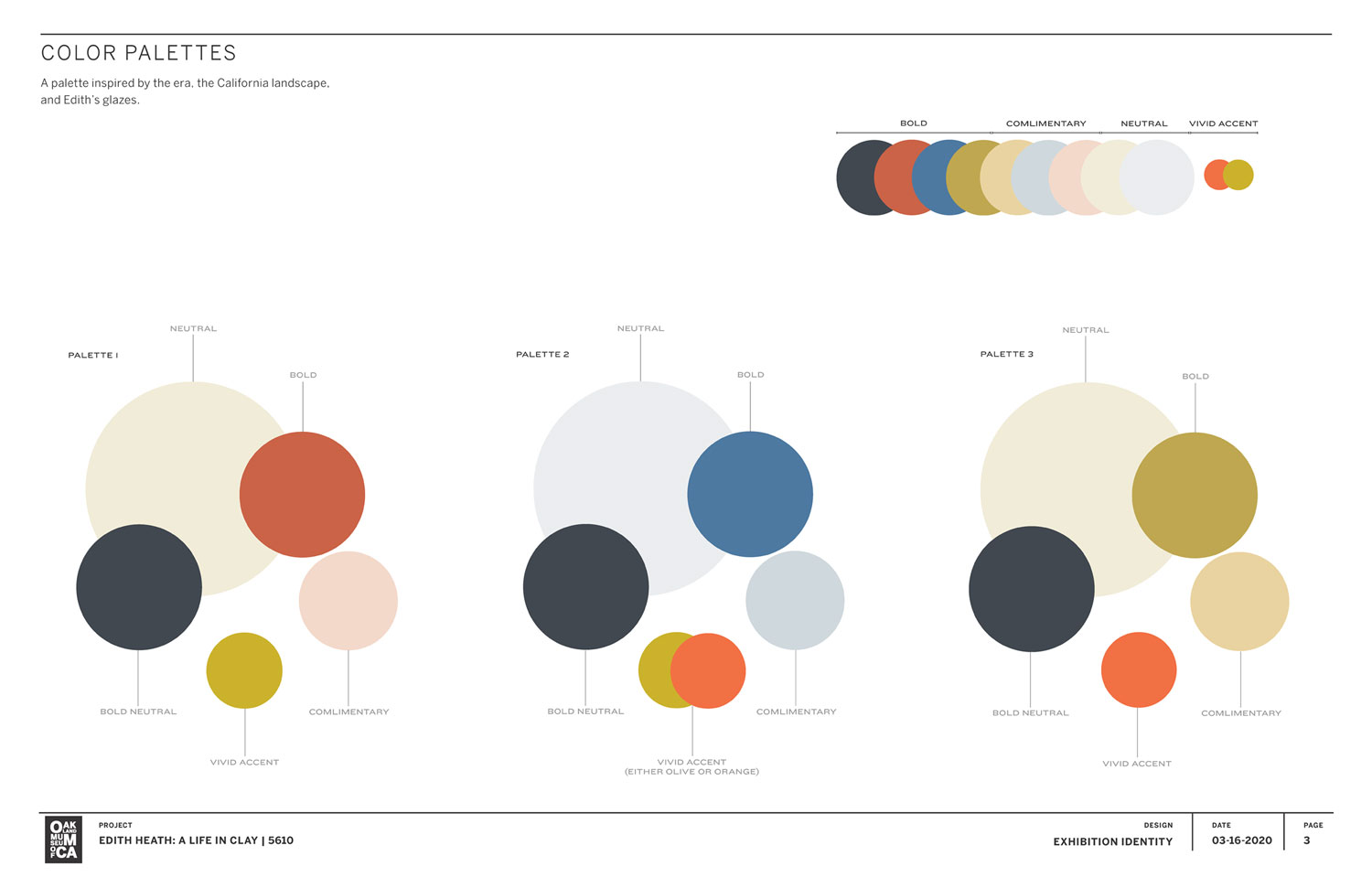 The color palette for the “The “Edith Heath: A Life in Clay” exhibition at the Oakland Museum.
The color must match your intended goal. If you want to create an inviting, warm space where people could sit and rest—something minimal, soft, and muted might be best. But, it’s a balance; you don’t want the space to be overly clinical, which can also be a trigger. Finding the right color is a matter of intent and identifying the needs of the audience first.
White vs. White

White walls allow hands-on and text elements to pop. More importantly, the wall color doesn’t detract from the building’s impressive cedar interior. US Park Police Horse Stables and Education Center in Washington, DC.
Remember the controversy about the 2026 Color of the Year, “Cloud Dancer”? Introduced by Pantone, the color is a billowy, lackluster white (personal opinion here). Some people consider it indicative of our dystopian times; others think it represents harmony, peace, and contentment. Whatever your thoughts, whites can be effective when used intentionally.
“There’s a big difference between the color white and white being used for negative space,” Auburn notes. “It’s really a tool. Minimalism has its place, in fine art exhibitions, for example . . .. If you’re displaying a bold painting, white is fine. It’s how you use the color in relationship to other things.” Or, conversely, “you could go with a dark space and have the objects in the middle.”
“Color is emotional for clients,” Auburn confesses. “I try to unpack it with them and explain my rationale.”
Tools that can help
Looking for a place to start? Paloma sometimes consults Adobe Color, a web-based service that helps you pair hues. “It can give you a sense of what would go best with a base color. It will give you shades, tones, and contrasts. You can save palettes into your libraries and extract colors from a photo. I’ve found this tool to be very helpful,” she says.
For accessibility, we often consult with digital tools like WebAim, which requires the user to input background and foreground colors to assess contrast levels. Of course, differences in color profiles on individual monitors don’t always give you the truest sense of color, but it’s close. Pulling from WAIG’s guidelines, AccessibleColors.com is another reliable source, and there are undoubtedly many AI tools out there that deliver color palettes in seconds, but at this stage, we still prefer an expert human approach. 😊
Have questions about colors or accessible design, ping us on LinkedIn.